FINAL DESIGN
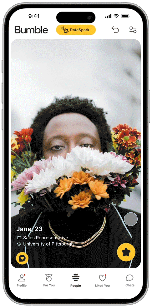
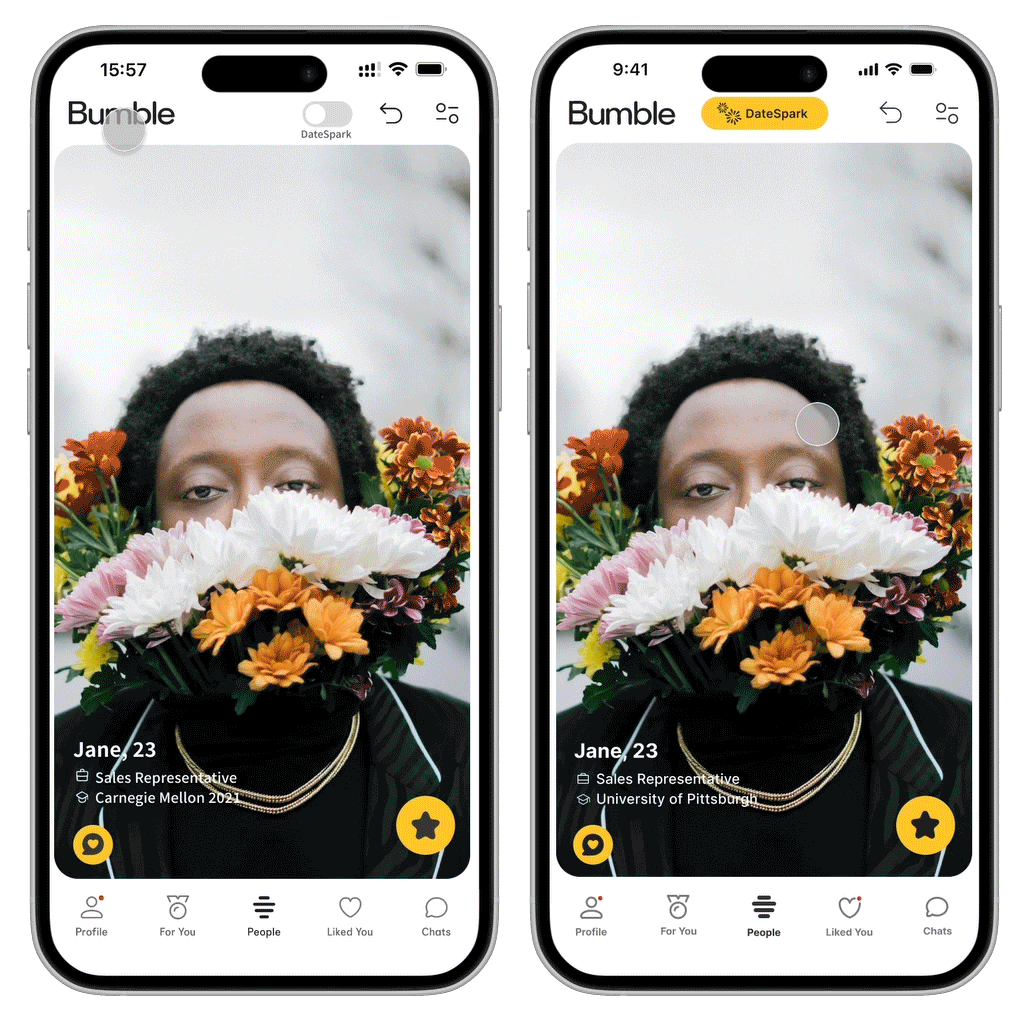
Here is the prototype of DateSpark Matching. As users swipe casually on Bumble, one would notice how Bumble only shows the profile person’s occupation and education at first glance. If the user would like to know more about how the profile person is compatible, the user would have to scroll down, read, and analyze. Then, the user discovers the DateSpark button, which shows a little animation of how the user can swipe and enter the DateSpark matching mode. The user then proceeds to swipe and set the first-time user preference. Once the preferences are set, a bee animation appears to highlight the change of mode. Now, instead of showing the typical occupation and education, the algorithm pulls people forward and shows aspects that the ML thinks make the user and the profile person a good match.
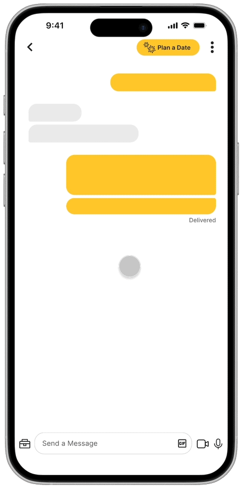
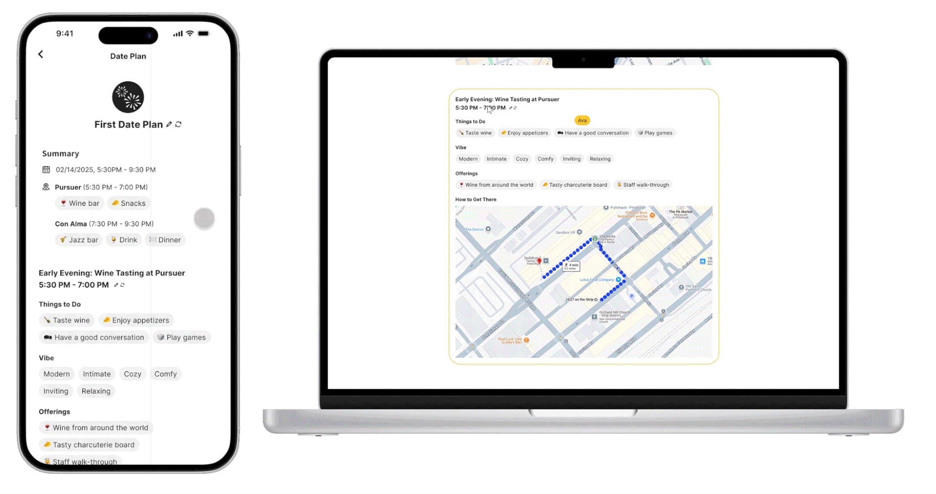
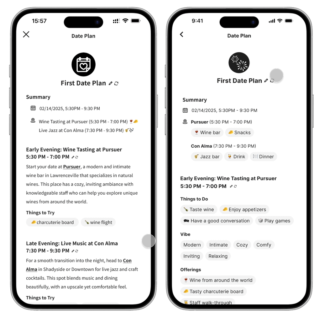
Here is how DateSpark Date Planning works for a non-premium user. The system detects that the users are planning to go out, which sets off the button-shaking animation to draw attention. Then, the non-premium user goes through a process of setting preferences to generate the plan. Users can re-generate plans or make edits. The desktop version allows both parties to edit the plan at the same time. Once the date plan is approved, it gets sent to the chatbox.

PROCESS AND DESIGN EVOLUTION
APPROACH
I began the project by reviewing the existing design brief, which identified the low conversion rate of Bumble users to premium services as the problem. The brief proposed Precision Location Services as a solution, but my secondary research on dating app user preferences suggested that users have significant safety and privacy concerns with similar functionalities. With only 4.8% of Bumble users subscribing to premium services, I saw an opportunity to increase conversions by offering a feature that provides clear, tangible value thus incentivizing users to subscribe to premium services.
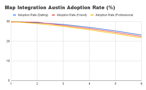
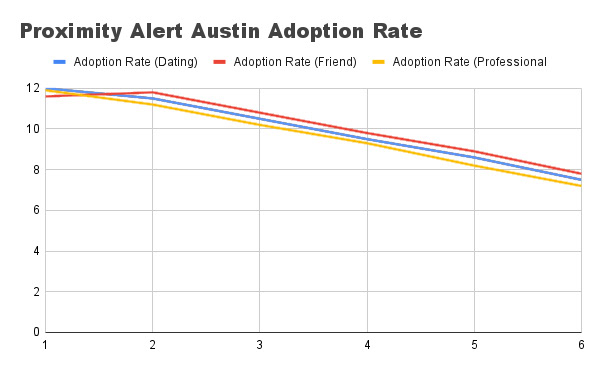
In addition, to better understand the problem, I analyzed Bumble’s data analytics on two previous features: Proximity Alert and Map Integration. The data revealed that:
○ Proximity Alert struggled with declining adoption rates and slow retention rate growth, likely due to privacy concerns and lack of perceived value.
○ Map Integration performed slightly better but still showcased a similar trend over time, indicating that users did not see persisting value in the feature.
These insights indicated the need for a feature that not only attracts users initially but also provides ongoing value to keep them engaged and interested in premium services.
DESIGN EVOLUTION & ITERATION
With these insights in mind, I brainstormed three preliminary concepts:
1. First Date Suggestion:
An algorithm that analyzes user profile information, past conversations, behavior patterns, and location (if opted in) to suggest the best first date location, maximizing the chances of a successful match for premium users.
An algorithm that analyzes user profile information, past conversations, behavior patterns, and location (if opted in) to suggest the best first date location, maximizing the chances of a successful match for premium users.
2. Conversation Assistance:
An AI assistant that helps premium users with conversations by suggesting topics, wording, and responses to keep the interaction engaging.
An AI assistant that helps premium users with conversations by suggesting topics, wording, and responses to keep the interaction engaging.
3. Profile Improvement:
A service that uses an algorithm trained on profile data and success rates to help users optimize their profiles for better matches.
A service that uses an algorithm trained on profile data and success rates to help users optimize their profiles for better matches.
Each concept had its own benefits and flaws. After discussing these ideas with classmates during critique sessions and some further research, Conversation Assistance seems to be less attractive and Profile Improvement lacks long-term value. Therefore, I decided to move forward with improving the First Date Suggestion concept, as it directly addressed the pain points of date planning and matching, which users often find inconvenient or challenging.
As I progressed, I realized that the same machine learning model trained on dating app user data could be applied in multiple areas of Bumble to provide different services. So, instead of limiting the algorithm to activity-based date planning, I expanded its scope to include personalized matching and date planning, as my secondary research indicated that these were the areas where dating app users found the most value—or the most inconvenience.
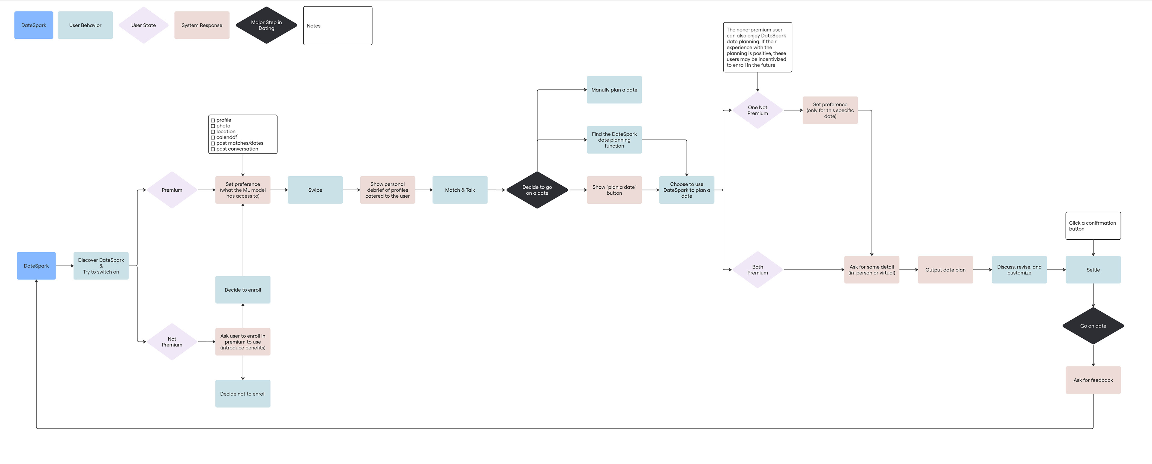
I focused on prototyping the two most important yet somewhat "unbelievable" moments in the user flow: using DateSpark to match and using DateSpark to create a date plan. I want these moments to be intuitive, engaging, and reflective of Bumble’s playful brand identity.
First Iteration & Final Iteration
1. Switching to DateSpark Mode
Initial Design: My first iteration used a toggle button to switch between normal Bumble and DateSpark modes, with a full-bleed preference page.
Problem: There wasn’t enough differentiation between normal Bumble and DateSpark, and the preference page felt disconnected from the rest of the app.
Solution: I replaced the toggle with a button that triggers an animation showing how to switch to DateSpark mode. The preference page was redesigned to not cover the full screen, providing a sense of continuity. I also added a bee animation and a theme color-change during the mode switch to exaggerate and make it more engaging.
2. Date Plan Page Redesign
Initial Design: The date plan page was text-heavy and dense, resembling a formal document rather than a playful dating app feature.
Problem: The plan page was overwhelming and uninviting.
Solution: I transformed the features of the date plan into bubbles of bullet points, aligning with Bumble’s design style. This also made the page more visually appealing and easier to read.
3. Collaborative Date Planning
Initial Design: My initial design for collaborative date planning was unclear. I did not fully think through the process.
Problem: The collaborative process was redundant and unclear.
Solution: For the mobile end, I allowed users to send confirmed date plans back and forth in the chat. In addition, I also incorporated cross-platform functionality, allowing users to work on date plans simultaneously via desktop.